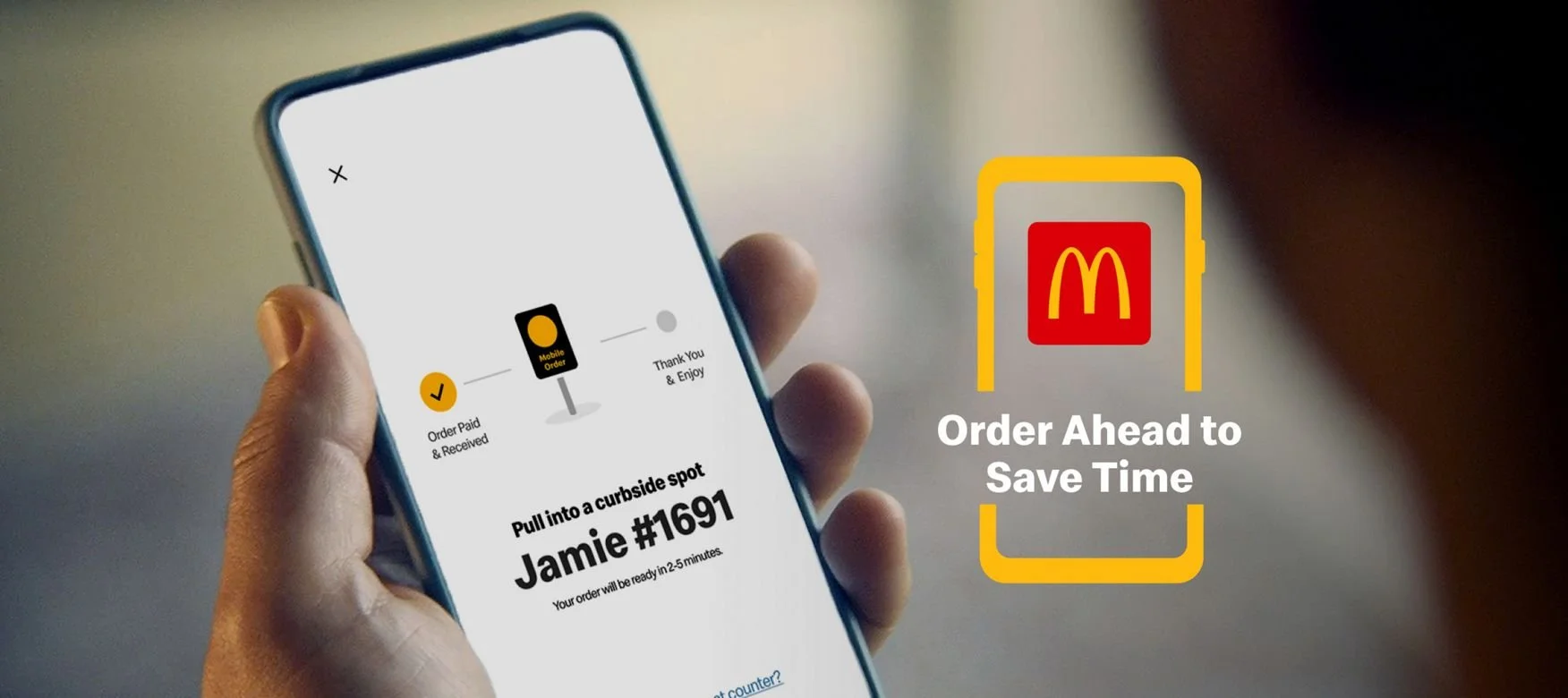
Mobile Ordering App Evaluation Case Study
Year: 2016
Role: Lead Researcher (Contract)
Context:
A leading global quick service / fast food restaurant noticed that their users’ needs were changing: they desired additional ordering flexibility and digital engagement. To address this, our client developed a mobile ordering app and updated service design which gave their customers a different way to order and pick up their food - creating a completely different service experience.
Problem:
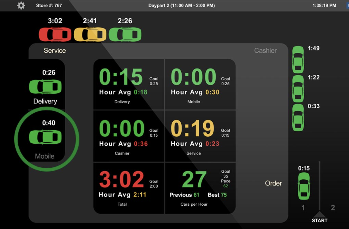
The client needed to evaluate the usability of the new omni-channel experience, where customers would use the app to order food and continuously alternate interactions between a number of digital and physical touch points. The challenge was to ensure seamless integration of these touch points in order to deliver a fast and smooth customer experience while minimizing disruption to the restaurant’s traditional service design and operations.
RITE + eyetracking
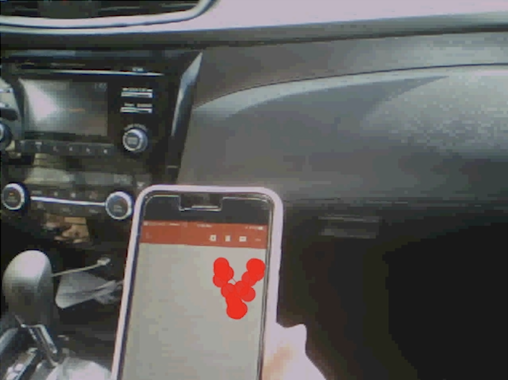

Our team designed a Rapid Iterative Testing and Evaluation (RITE) study. We recruited a variety of brand users and had them meet us for 1:1 “ride alongs” and interviews at the restaurant. As each participant arrived, they were fitted and calibrated with mobile eye tracking glasses so that we could track exactly what they were looking at and when.
With technology like a mobile ordering app, it is important to consider how users are interacting with the app and the world as they move through their order/pick up journey. Once the glasses were calibrated, researchers got into the user’s passenger seat to “ride along” as users downloaded the app, created an account, placed an order and picked it up.
Following the ride along, researchers invited the participants inside of the restaurant to eat, map and discuss their experience, and review the eye tracking video.
Daily Collaboration
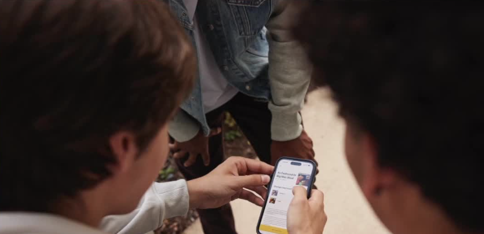
Delights and pain points were noted after each interview and recommendations for quick updates were provided at least once a day. Engineers would update the prototype prior to the next day’s testing sessions to repeat the process with the next design iteration.
Report & Shareout
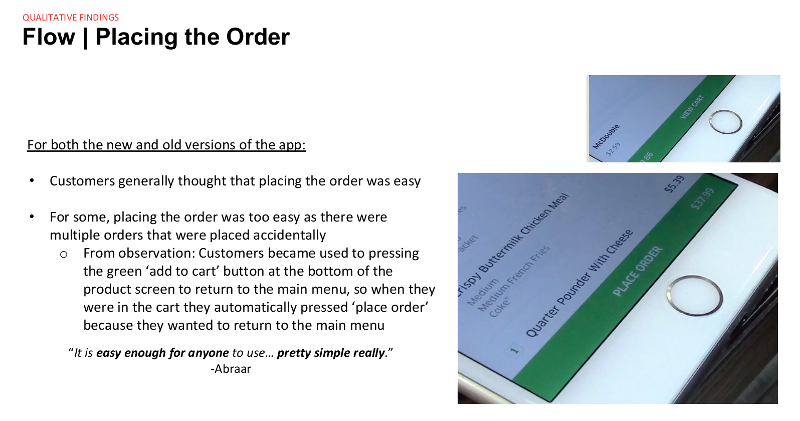
After fielding, we provided the client with a full report which included additional design updates that they should consider in order to provide customers with a great experience.
Sample insights:
Customers that selected to receive their order in a parking spot sometimes had an extended wait because the kitchen staff weren’t used to running food outside. We recommended additional training for the kitchen staff and for the mobile order pickup area to be more clear on the kitchen’s assembly screen.
Users often could not find the floating navigational menu because it was being covered up by their thumb as it hovered over the screen, therefore, we recommended that the navigational menu be moved to the top of the screen.
Users were confused by menu item categorization and naming, especially desserts and kids’ meals so we suggested that categorization names should more closely resemble how users refer to those food items instead of using company/industry jargon.
Item customization tools did not allow users to customize their items in the way they wanted, therefore, we recommended that additional ingredients should be added to the customization menu which, at a minimum, should allow users to swap out cheeses and add favorite sauces.
When an item was added to the bag, users didn’t know what to do next, therefore, we suggested to add a prompt after an item is added to the bag to maintain a smooth flow and keep users focused on the ordering process.
Outcome:
The app was updated and released worldwide, and downloaded 127 million times in 2022.
In the News: Launch of mobile ordering app
