
App Design Case Study
This was my capstone project for my Associate Degree in UX Design.
Context
Part of the coursework to earn my Associate in UX Design required designing a medium fidelity booking app prototype. I decided to focus my efforts on making a hotel booking flow that was as fast and easy as possible to optimize the user experience and command market share.
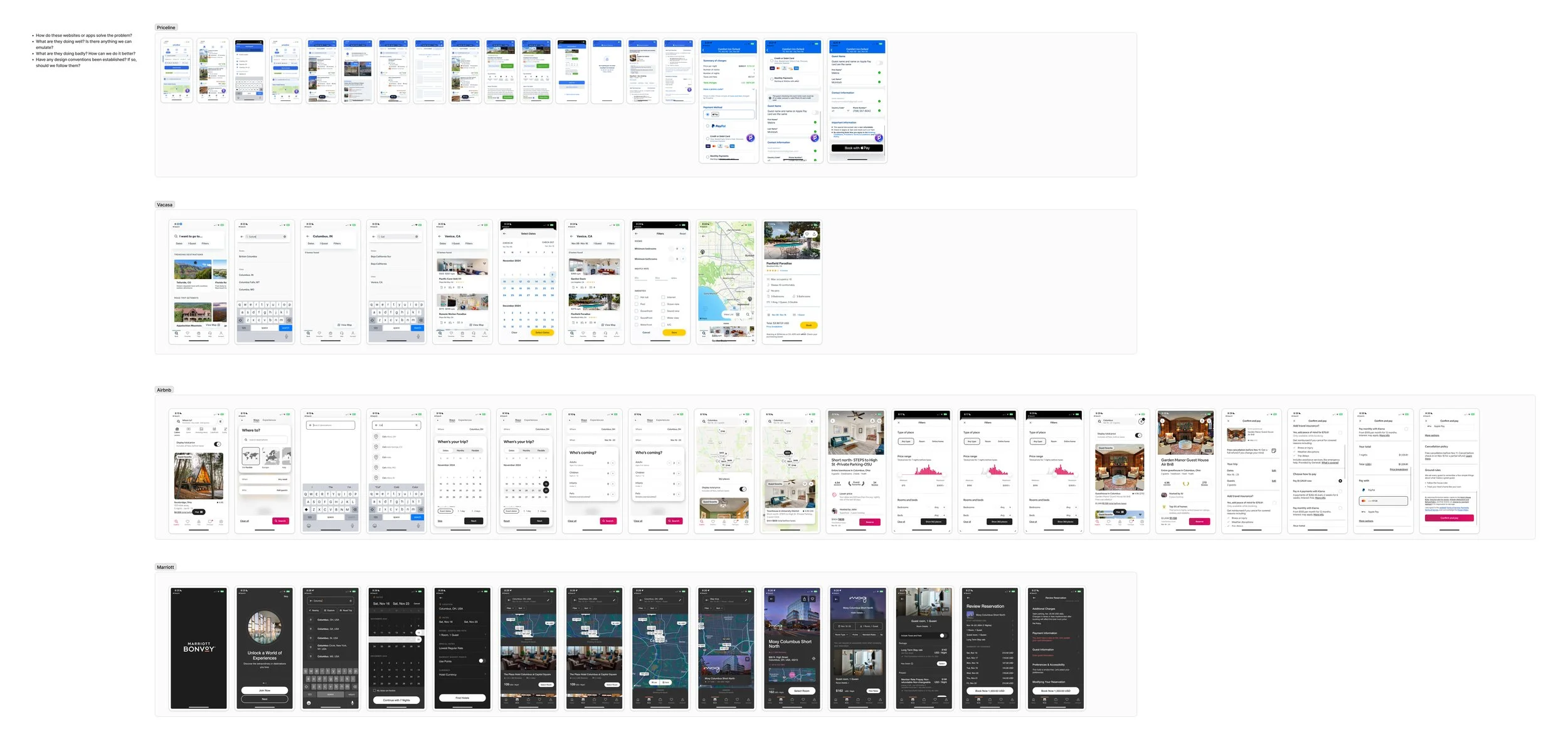
Competitive Benchmarking
My design process began with competitive benchmarking. I selected four mobile booking apps to better understand the hotel booking space along with the flow, design, and potential differentiating features.
User Interviews
I conducted user interviews to understand delights and pain points with two competitor mobile booking apps.
Key Insight 1: Users must be able to easily jump back and forth between the list and the map, therefore, the integration and interaction with the map and list must be seamless.
Key Insight 2: It was easy for users to get overwhelmed with too many options, therefore, using progressive disclosure to only show the right information and options at the right time in the flow is essential.
Key Insight 3: Users lacked confidence in reversing the flow. Back buttons did not provide enough context so users did not know where the back button would take them.
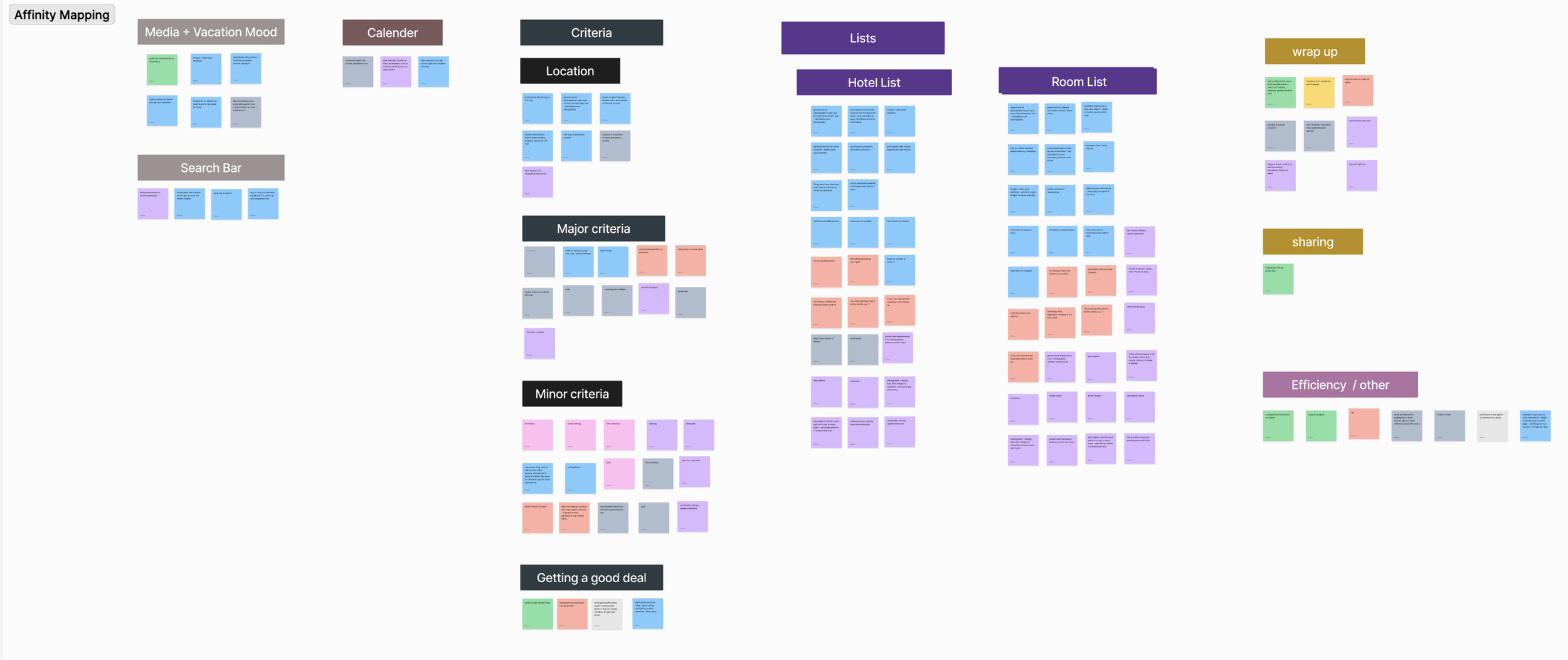
Affinity Mapping
In order to do a thorough analysis of all of the user interviews, I did an affinity map where I moved all of my notes onto stickies. Each stickie had a single bullet point. I then organized the notes into themes. This method of analysis helped to surface key areas where I should focus in creating the booking flow.
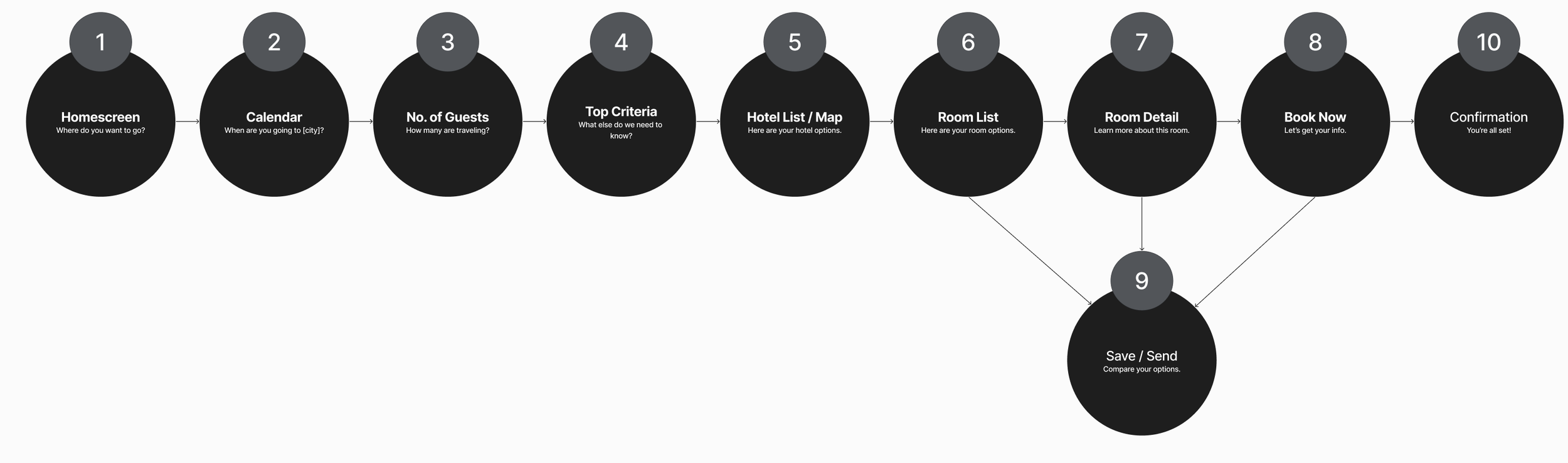
Flow Framework
I sketched out a draft flow based on information from the user interviews and affinity map. In designing the flow, I tried to think of it as a conversation between the app and the user to make the experience as smooth as possible.
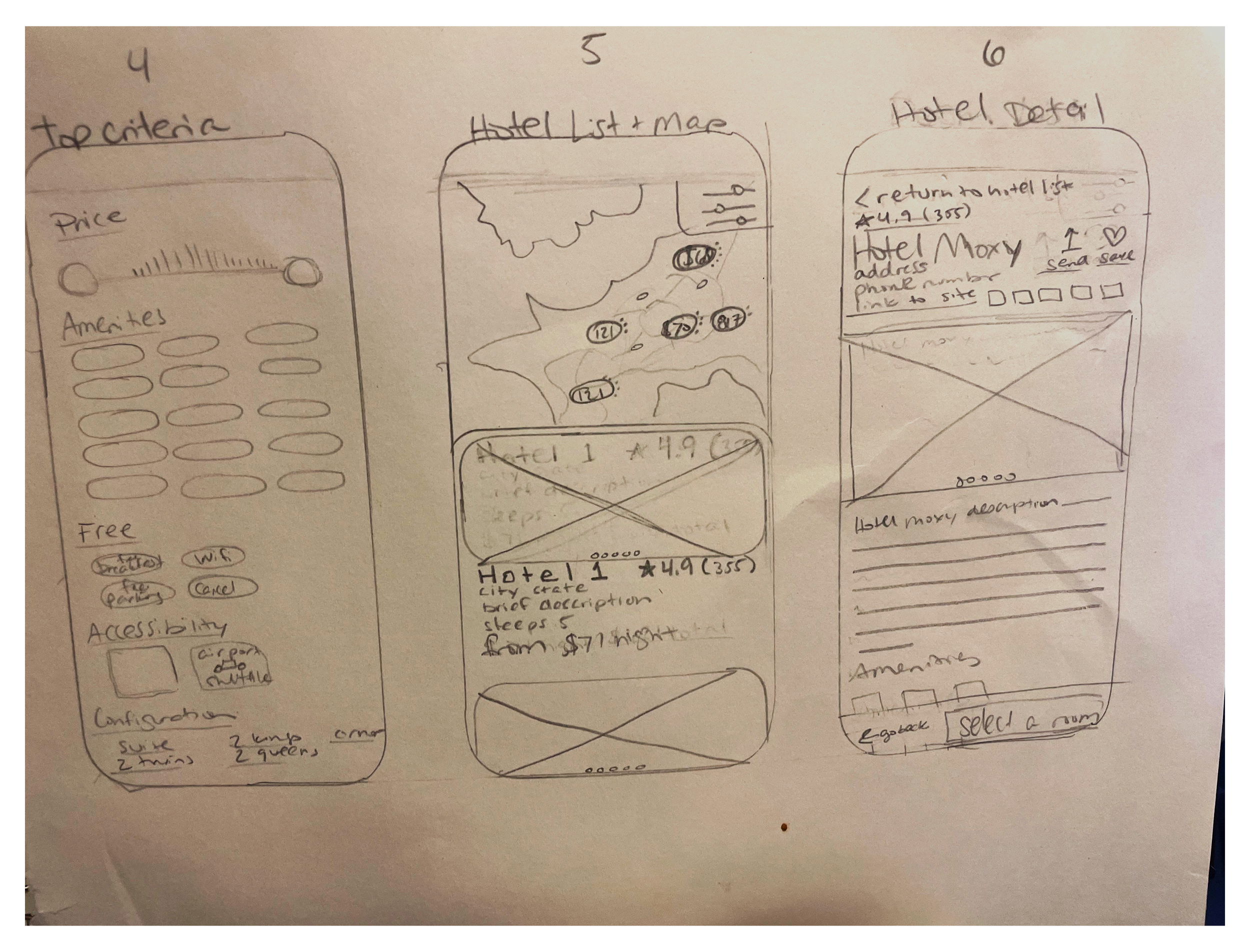
Sketch
The design started coming to life with quick sketches of each screen. Screen designs addressed pain points that surfaced during the user interviews.
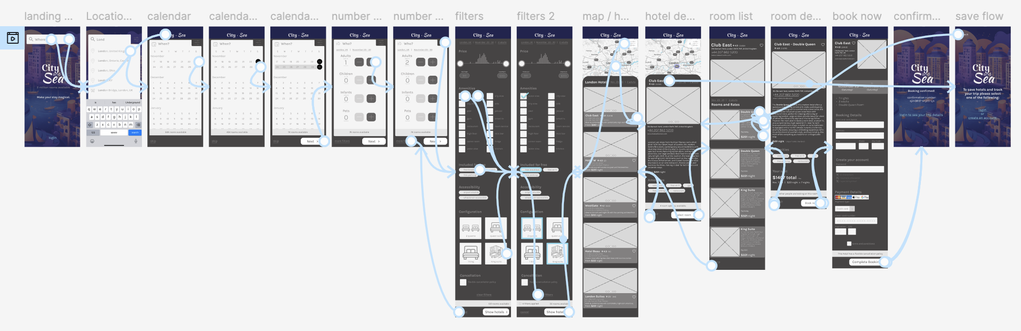
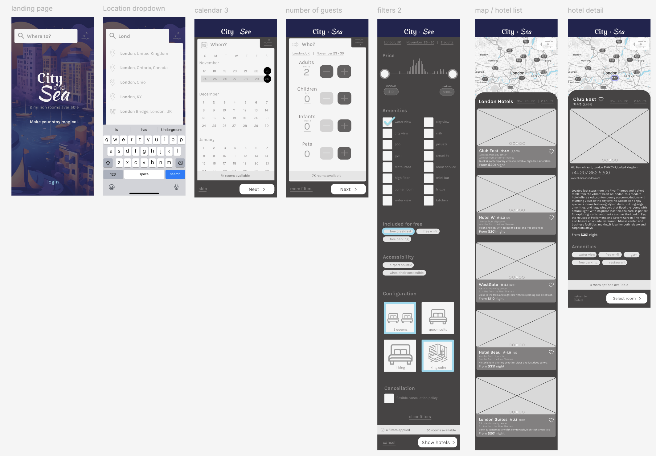
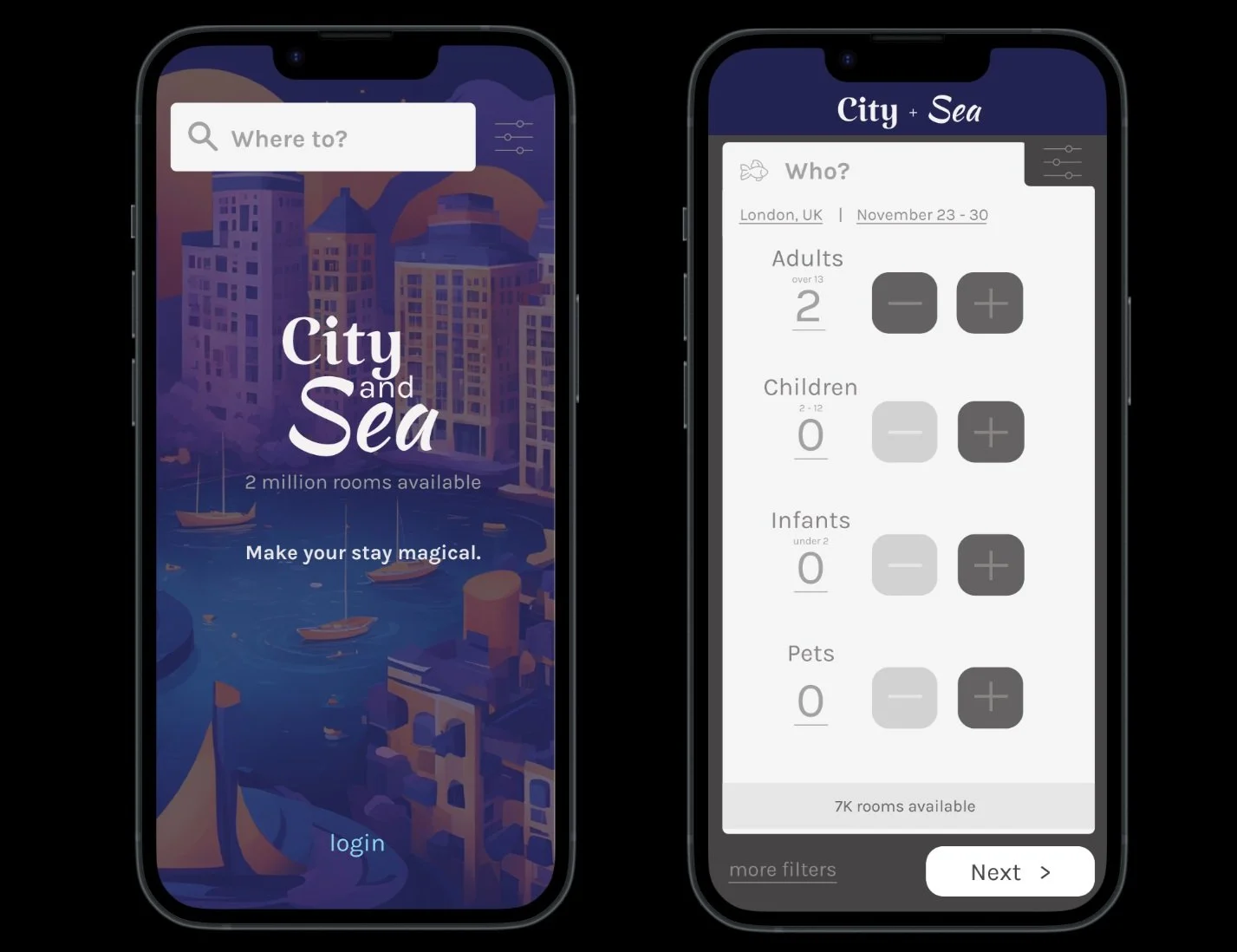
Design in Figma
I utilized Figma to translate the sketches into wireframes and then into a medium fidelity prototype.
My goal was to create a clean, intuitive design that utilized progressive disclosure to provide the right information at the right time. I included chunky / easy to hit buttons when possible, and a map feature that makes it easy to jump back and forth between the map and the hotel list. Calls to action were designed to be easy to locate and understand.
ChatGPT helped me to create realistic copy for testing the prototype.
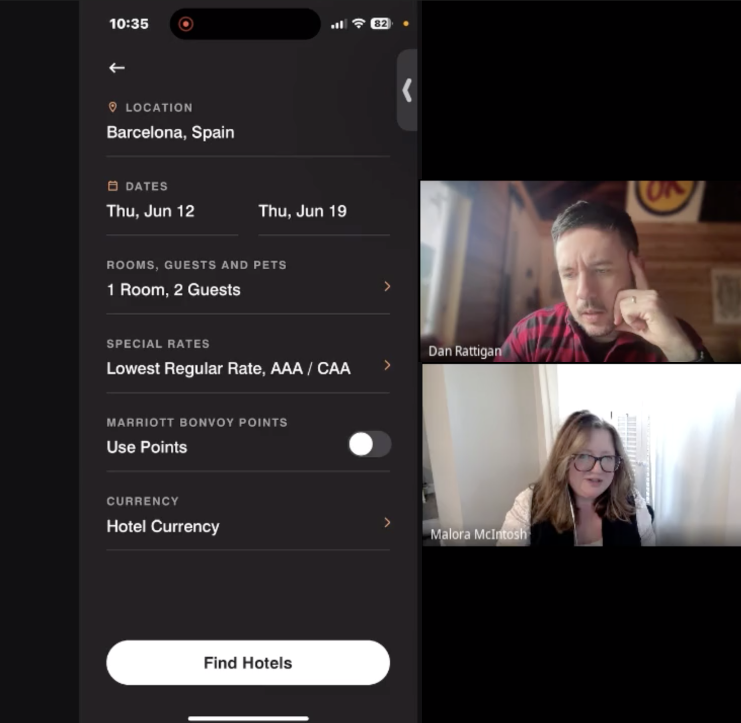
Usability Testing and Revision
Users tried out the new design in usability tests with a click-through prototype. It was exciting to see how easy it was for users to go through the booking flow and screens. While the foundational design tested well, I did make a few updates based on these tests.
Insights and updates:
Users wanted the ability to share hotels to their friends and family so I added a share icon in areas where it would not distract users from completing their booking.
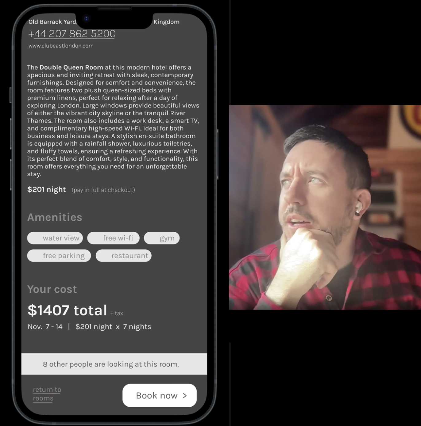
Users wanted to see the total cost prior to arriving at the booking form screen so I added a total calculation on the room detail screen.
Outcome
I received high marks for my design and prototype - and am very close to successfully earning my Associate Degree in UX Design, jointly awarded by the UX Design Institute and Glasgow Caldonian University.